Project context
My role
Project duration
Mentor
This was a UX/UI focussed project forming part of the final year of my Information design degree.
This was a solo project therefore I am responsible for all the processes and deliverables including UX research, user personas, user interviews, flow diagrams, wireframing and prototyping as well as designs.
3 weeks
Nicola Lotter
About the project
Problem Statement
The University of Pretoria’s (UP) is in a process of transformation; they want their institute to embrace forward thinking values that will prepare their students for the changing socio-political landscape. Therefore the website needs to be redesigned to represent the University's new ethos. Additionally the current UP website is extremely difficult to navigate and they want to make it more accessible for users.
My chosen user journey
Choosing what to study is a daunting task, but poorly designed user interfaces and user journeys make it increasingly more difficult to make an informed decision. Thus, I hypothesise if the information is filtered correctly and presented concisely students can be aided in the process of choosing a degree, and not hindered.
Therefore the user journey I choose is accessing course information, renamed What to Study. If you were wondering why I felt passionately enough to spend 3 weeks of my life on this? Because I knew this was a real need. My brother was busy applying for University and he got lost in the all the programmes that were available.
Objectives
1.
Improve 1 user journey (finding course information)
2.
Redesign the UP homepage
3.
Rebrand the UP website
Understanding
With my project it was a delicate balance between helping prospective students find degree/course information, but not alienating or dismissing other users which might have valuable insights. Therefore my initial research was broad, but became specific as the project progressed. The first stage I spent understanding the problem.
1. Find a user journey
When I started this project I already had a user journey in mind, finding course information. Therefore, I spent my time understanding the current UP homepage and finding course information user journey.
Information architecture
Remapping UP's homepage
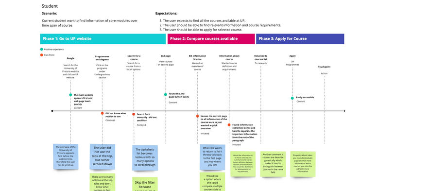
User journey information mapping
I mapped the journey a prospective student would take to identify possible pain points and positives experiences.

Key findings
-
The homepage is difficult to navigate and struggled to find course/degree information.
Interviews
During the interview parts of my project, I interviewed 10 people throughout the project. Firstly I tested the existing Yearbook functionality (this was UPs name for degree/course information).Secondly, I gathered insight into the user journey for prospective students, parents and current students. Thus gaining a better understanding of the users motivations and frustrations. Furthermore, I constantly re-interviewed my users and reiterated their feedback into my designs.
Interview objectives
-
Identify my users and their technology literacy levels
-
Evaluate how users navigate the current website.
-
Recognise pain points.
-
Identify working elements.
-
Understand what users want from the degree/course information.
-
Observe how users find degree information.
-
Understand how users filter information
2. Initial interviews
Understanding the current homepage, website shortcomings, and testing hypotheses of prospective & current students wanting better degree/course information.
Interview notes
Key findings
-
Users do not use search function.
-
Website is confusing.
3. Creating personas
The main users I identified for the website is prospective students, current students, parents or guardians. My first priority persona will be prospective students since they are the main users of the What to study functionality.
First priority persona

Second priority persona

Third priority persona
I included this persona to compensate for users that have a lower technological literacy level.

Prototyping
In this phase I tested many different versions of my project, thus improving my project with each iteration.
4. Creating low fidelity paper prototypes
Understanding the wants, needs & frustrations of my user.
UX Research
For this project I did a UX research paper, thus taking UX best practises and contextualising it with my user interviews, user journeys, wire-framing and paper prototyping. The paper also includes my competitor analysis.
5. UX best practises


6. Competitors analysis


Wireframing
7. Minimal viable product
Low fidelity paper prototypes


Prototyping interview script and summary


Key findings
Landing page:
-
Naming conventions are confusing.
-
Want pictorial image to aid in wireframing.
What to study page:
-
Want suggestions on how to filter information, e.g. commonly searched words.
-
Some buttons heavy design was distracting.
-
Want an indication of selected programmes when comparing.
Degree information page:
-
Current button like design feels weird, would prefer columns.
Online application guideline page:
-
Users prefer the icon system to a long video tutorial.

8. UI Interaction notes


